Define Form Fields and Layout
You can design a form by defining its layout and selecting the data displayed in each section. A form consists of tabs, which contain sections, and both can be formatted with one or multiple columns.
Design the Form Layout
To design form layout:
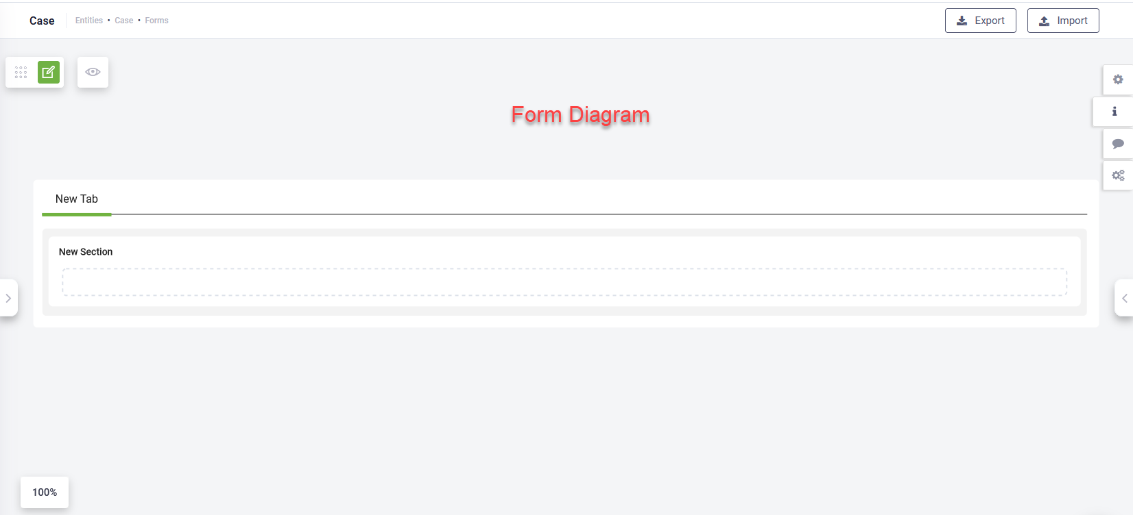
- On the entity’s Forms page, click the Edit icon (
 ) next to the form you want to modify. The Form Designer opens, displaying the Form Diagram with a default single-column tab and an empty section.
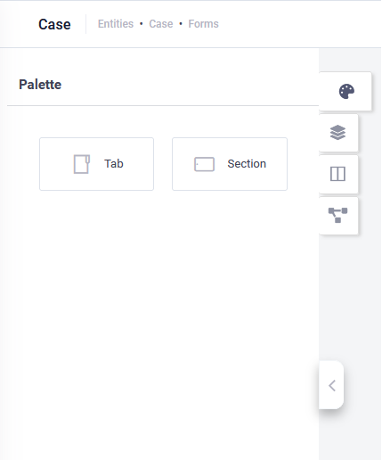
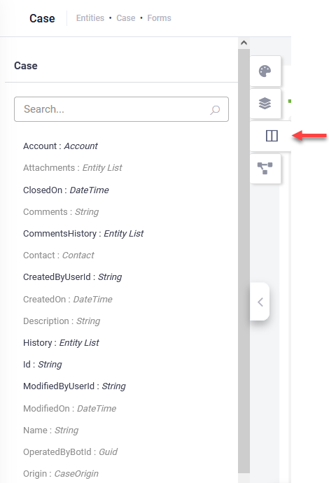
- Click the Palette icon (
 ) to expand the Palette panel. It contains two elements:
- Tab – Organizes form data, allowing users to navigate relevant information.
- Section – Organizes content within a tab.
- Drag a Tab from the Palette and drop it onto the Form Diagram.
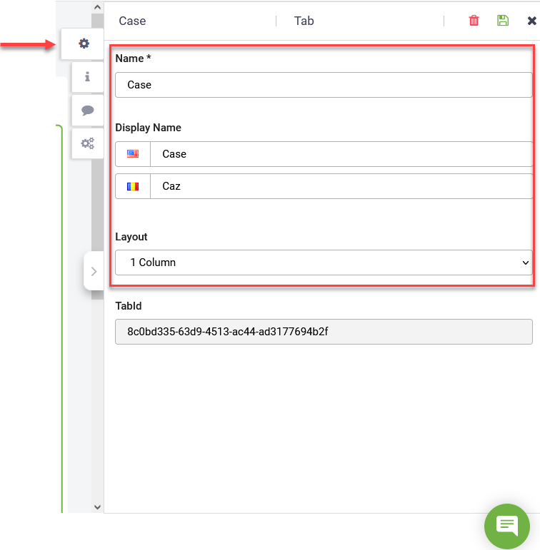
- Click the tab, then in the settings editor, enter the tab Name and Display Name.
- To arrange tab content in multiple columns (newspaper-style), select the desired number of columns from the Layout field.
- After adding tabs, drag Section elements into each tab from the Palette.
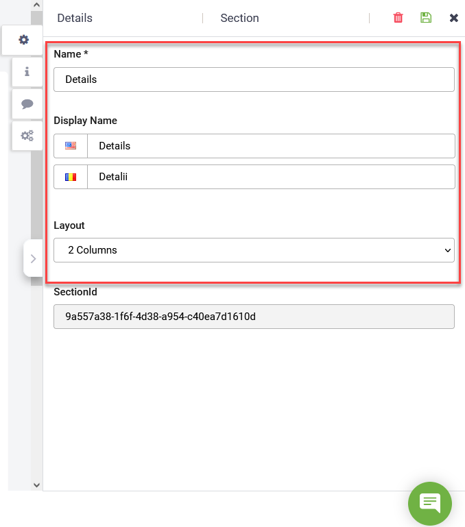
- Click a section, then in the settings editor, enter the section Name and Display Name.
- To arrange section content in multiple columns (newspaper-style), select the desired number of columns from the Layout field.
Add Fields to Sections
To populate sections with data, add fields from the current entity or related entities.
- Click a section in the Form Diagram.
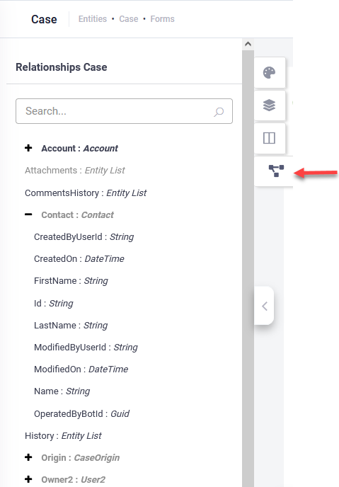
- On the left pane, select:
- Fields icon – Displays fields from the current entity.
- Relations icon – Displays fields from referenced entities. Click the Plus icon next to an entity to expand its fields.
- Drag a field from the list and drop it into the section.
- By default, fields display in one column and one row, are editable, and appear on both desktop and mobile.
- You can reorder sections within a tab using drag-and-drop.
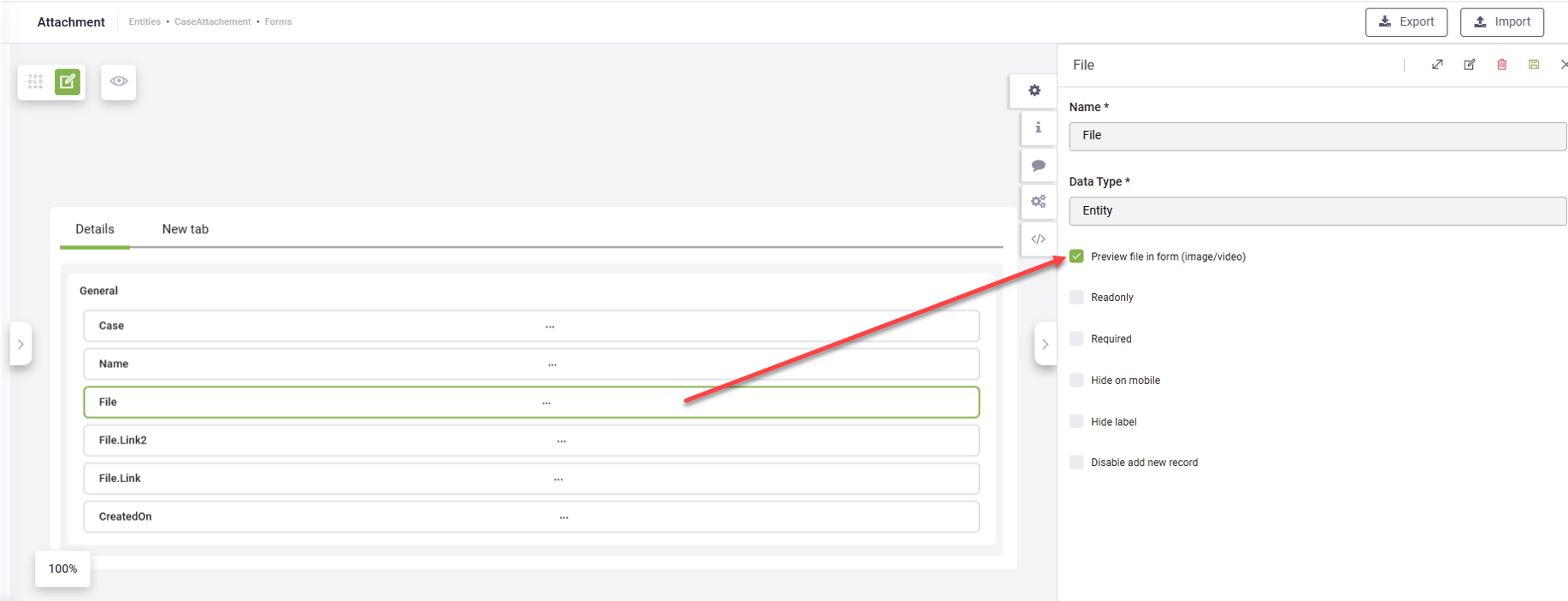
Configure Field Properties
Click a field in the Form Diagram, then in the right editor, configure its properties:
| Field Property | Description |
|---|---|
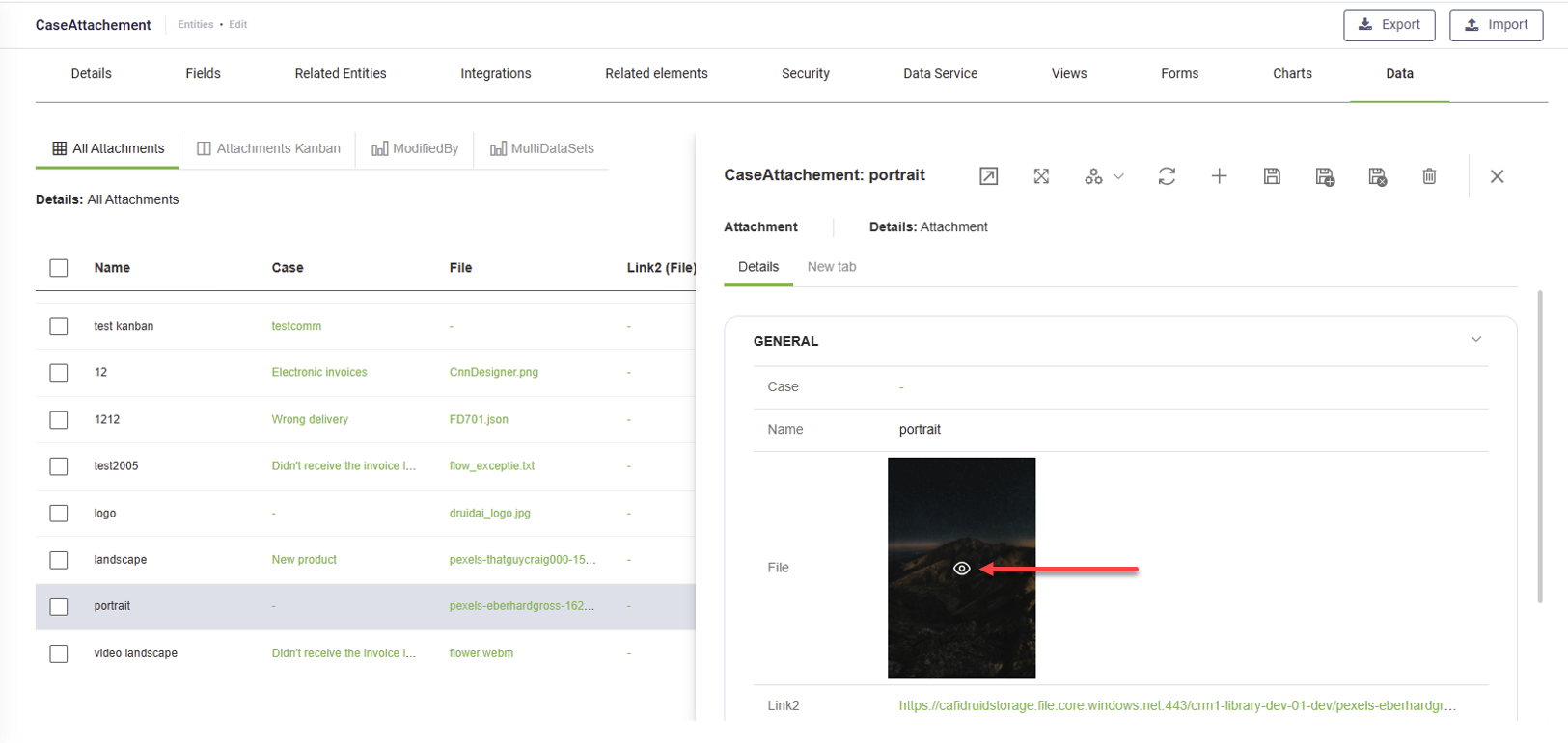
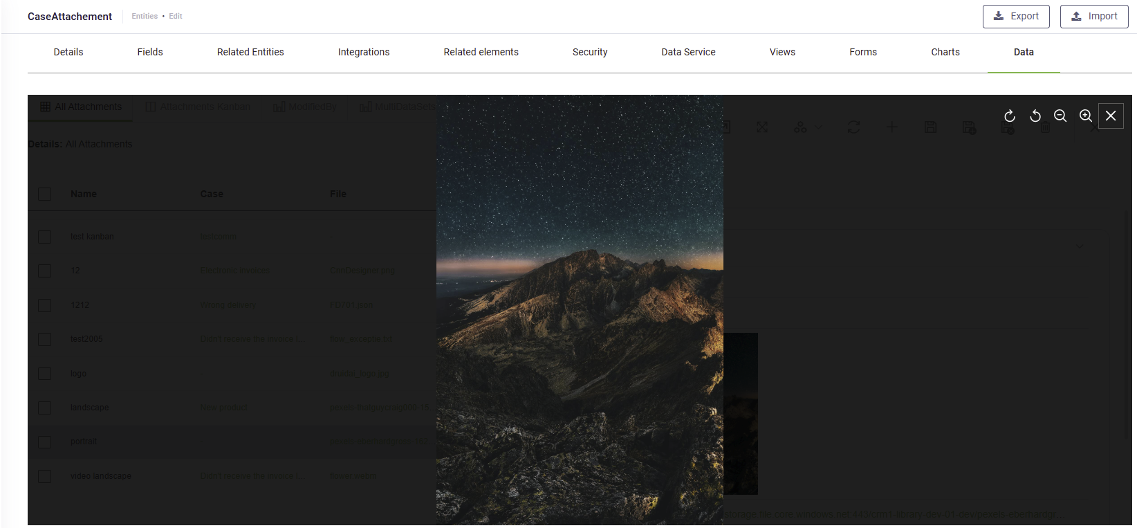
| Preview file in form (image/video) |
Enables image and video previews directly in the form. NOTE: This parameter is available in DRUID 8.6 onwards only for File fields.
|
| View |
Displays a custom view for users when they click the entity field. If left empty, the field uses the default entity view. NOTE: This parameter is available in the form configuration only for fields of type Entity or Entity List.
|
| Column span |
Defines how many columns the field spans (1–3). Default: 1. |
| Row span | Defines how many rows the field spans (1–3). Default: 1. |
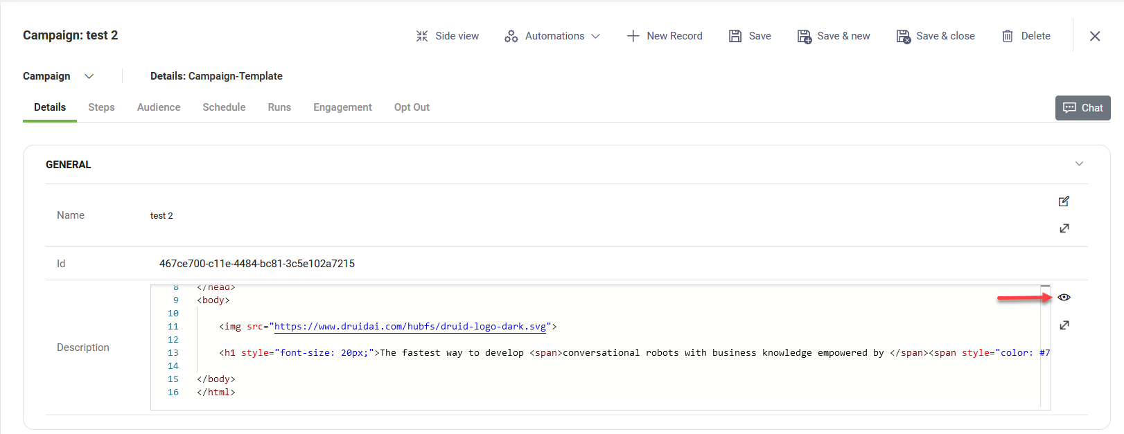
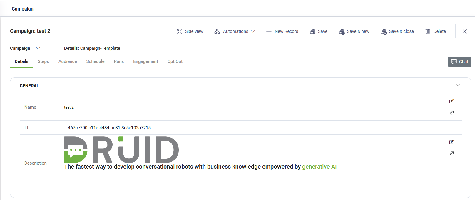
| Control type |
Allows configuring String fields to support various input formats, including HTML, JavaScript, JSON, Markdown, XML, and SQL. Info: If you select a control type other than the default String, adjust the Row span setting to ensure optimal form display.
For fields with Control Type set to HTML, users can preview the executed HTML code directly in forms.
|
| Edit mode default |
Allows users to edit non-String fields by default without clicking the Edit icon.
|
| Read-only |
Prevents users from modifying field data (e.g., GUID fields should be read-only). |
| Hide on mobile | Hides the field when users access the form on mobile devices. |
| Disable add new record |
Prevents users from adding new records in Entity or Entity List fields. Useful for drop-down selections. |
| Disable navigation |
Prevents navigation to special views when clicking an Entity or Entity List field. |
To ensure proper layout and formatting, preview the form to see how different field types appear at runtime.
After defining the columns, you can populate the form with data by adding integrations.